Why do many of us prefer data visualization? Because it is straightforward to understand and helpful in obtaining valuable insights. Moreover, Would you instead look at massive data tables and then decipher the information, or would you instead look at a data visualization that displays the information in an easy-to-understand visual format? We prefer to choose the visualized format because it allows you to understand the data instantly.
If you want to learn more about data analytics, you can join Tableau Training in Chennai and learn essential topics such as Graphs, Filters, Parameters, Maps, and Tableau Dashboards.
Before moving on to the in-depth understanding of how is data visualization used, types of data visualization, data visualization tools , and importance of visual representation of data, we shall discuss what is data science and Data Visualization?
What is Data Science?
The company gathers vast quantities of data in real-time. Data is becoming the backbone of business decision-making, so Data Science is projected to be one of the most in-demand careers in the following years. Additionally, the volume of the data generated, transferred, collected, and consumed worldwide is expected to increase every year. Data science has demonstrated its ability to extract useful information from huge amounts of data. These insights assist firms in identifying any significant modifications that are required in light of changing consumer behavior, previous solution faults, upcoming issues, and competitor evaluations.
Moreover, the demand for data scientists is due to the industry's scarcity of competent specialists. Even though demand for data scientists is at an all-time high, there is a significant demand-supply imbalance due to a shortage of skilled individuals. Several firms collaborate with ed-tech companies to address the critical gap in training their personnel and developing internal training programs.
If you want to head your career in data science, you can join Data Science Online Course and learn from the basics like Data Science with Python, introduction to Python, list, Ranges & Tuples in Python, and Python Dictionaries and Sets.
What is Data Visualization?
Data visualization is the graphical representation of huge data through visual communication. As a result, we can comprehend enormous volumes of information in a single format. Furthermore, it is an effective approach to comprehension since quantitative data is difficult to comprehend because it is provided in tables and is tough to interpret. Moreover, we convert an enormous volume of data into valuable information using visual pictorial communication.
Visual elements such as charts, graphs, and maps are used to represent quantitative data and information graphically.
Moreover, data visualization can convert massive data into a small set of data visually, which would be understandable for human processing.
If you intend to become a data scientist, you can join Data Science Course in Chennai, which will help you have a profound understanding of the Data Science Life Cycle, Machine Learning, Deep Learning, Artificial Neural Networks and many other core concepts of data science.
Data Visualization Tools
Outliers, trends, and patterns in data can be easily understood using data visualization tools. Data visualization tools such as Tableau, Infogram, Chartblocks, Datawrapper, Plotly, RAW, Visual.ly, D3.js, Ember Charts, NVD3, etc.
Moreover, to evaluate huge amounts of data, data visualization tools and technologies are required in the Big Data environment.
If you want to become a big data engineer, you can join Big Data Training in Chennaiand learn the core concepts, key tool and Distributed File System, etc.
Data visualizations are all around you, yet they always come in the shape of graphs and charts. In addition, Infographics are still used to describe combining numerous representations and bits of data.
Data Visualization Techniques
Unknown facts and patterns are discovered via data visualizations. Visualizations can be in the form of line charts that show change through time for observing relationships and drawing comparisons; in such cases, bar and column charts are helpful. A pie chart is an excellent tool for displaying sections of a whole. And maps are the most effective visual representation of geographic data. Data visualization techniques areBar Chart, Histogram, Gantt Chart, Heat Map, A Box and Whisker Plot, Waterfall Chart, and Area Charts.
Today's data visualization tools expand beyond the charts and graphs found in a Microsoft Excel spreadsheet to include dials and gauges, geographic maps, heat maps, pie charts, and fever charts.
For example, if you compile a data visualization of an organization's profits from 2011 to 2022, create a line chart. It would be better to understand through the flow and drop, but it cannot be adequately comprehended if it is in the form of the data table.
If you are interested in becoming a data scientist, you can join a Data Science Course in Chennai and learn types of data visualization, how is data visualization used, and the Data Science Life Cycle.
Now, we shall discuss What is visual representation of data, how is data visualization used, and data visualization in data science.
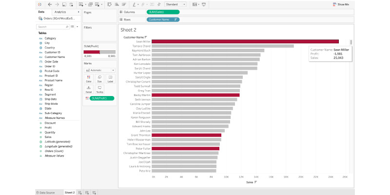
1. Data Visualization Discovers the Trends in Data
Data Visualization Identifies Data Trends. The most crucial function of data visualization is to uncover data trends. Moreover, observing data trends is much easier when everything is set out in front of you visually rather than in a table. For example, the Tableau table below shows the total sales of each customer in descending order. However, the color red represents loss, whereas the color grey represents profit. As a result, it is clear from this diagram that even though some consumers have large sales, they are still losing money. From a table, this would be difficult to see.
2. Interactive Data Visualization
Textual table-based data cannot be used to communicate with users in the same way that data visualization can. Moreover, data visualization displays users' messages from a unique perspective, making it interactive by default. Users can also zoom in on specific areas of the data visualization that interest them and learn more about that piece of the data. The viewer can also get a holistic perspective of the data by using several types of charts and various colors, shapes, and other elements. This interactivity also enables viewers to grasp the data visualization at a single glance, which is a difficult task for most people.
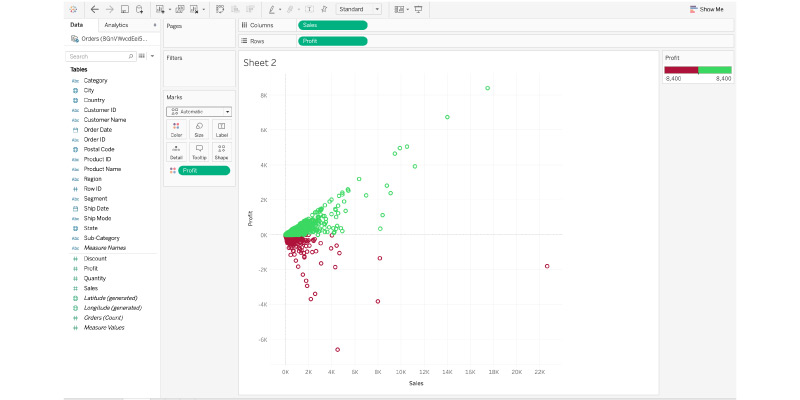
3. Data visualization gives you a different perspective on your data
Data visualization provides context to data by illustrating its significance in a larger context. It shows how specific data references affect the overall data picture. The Sales and Profit data visualization on Tableau below provides a data perspective on these two variables. It also shows that extremely few sales exceed $12,000 and that more significant sales do not always imply a higher profit.
4. A data process is explained through data visualization
Data visualizations can be used to depict how a data process works from start to end. To communicate a process, several distinct charts on a data story dashboard might be utilized. This strategy allows viewers to acquire a huge amount of information in simpler displays, making it easier to absorb the data and comprehend the overall data process. This could be difficult to express without graphics since readers would not comprehend the data process simply by looking at data tables.
5. Data Visualization Inspires Creativity
Nothing can pique viewers' interest like a well-designed and presented data visualization. Compared to written tables, visual representations have far more potential to evoke imagination; humans are fundamentally visual creatures that comprehend data considerably more quickly when provided visually. This also helps them engage their imagination and study the visualization in greater depth, providing more insights than simply reading dry texts and evaluating a data table.
6. A Data Story is Told Through Data Visualization
A data visualization can present a story about data to the audience. The visualization provides the facts in an easily understandable format while also delivering a tale and bringing the audience to an unavoidable conclusion. This data narrative should have a strong start, a basic outline, and a clear conclusion like any other story. If a data analyst is tasked with creating a data visualization for company leaders that details the profits of various items, the data story could begin with the profits and losses of multiple products before moving on to advice on how to address the losses.
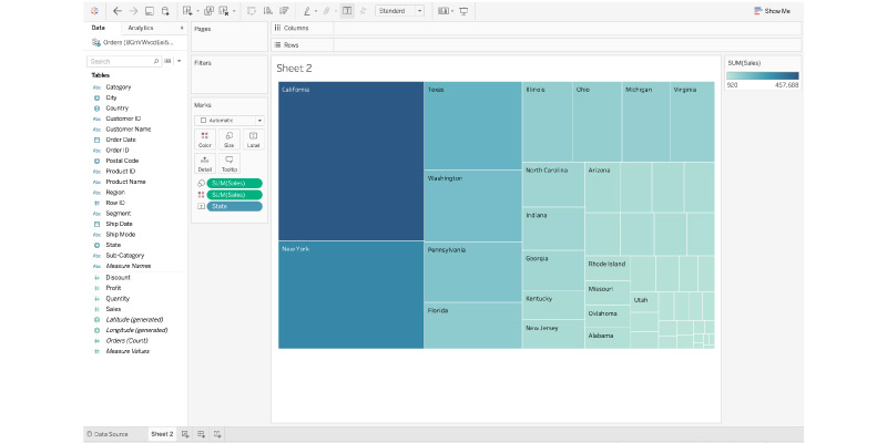
7. Data Visualization Places Information in the Right Context
Data visualization makes it difficult to identify the context of the data. It is pretty difficult to grasp by simply reading numbers in a table since context reveals the entire conditions of the data. In such a case, TreeMap is used in the Tableau data visualization, demonstrating the number of sales in each area of California. Because the rectangle for San Diego is the largest, it is evident that California has the most sales out of the total. However, this information is difficult to comprehend without data visualization out of context.
8. Data Visualization is Educational for Users
The information is conveyed and told to the audience through data visualization. It is a method of communicating information to viewers. It cannot be taught, but it can be understood. As a result, adopting data visualization in teaching would give students better comprehension.
As a result, it can be utilized in an educational setting to quickly present viewers with knowledge on a wide range of topics.
To learn more about data visualization tools, visual representation of data and data visualization techniques, you can join Data Science Courses in Bangalore and equip yourself with theUnderstanding Artificial Intelligence, Overview of Implementation of Artificial Intelligence, Machine Learning, and Deep Learning concepts.
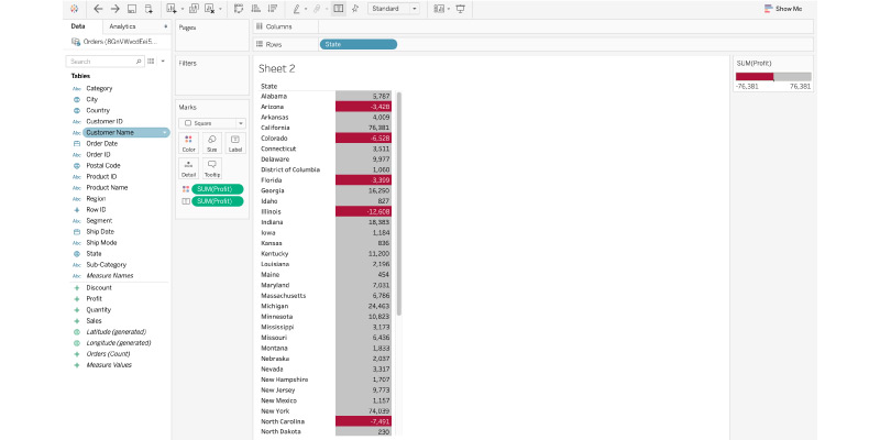
9. Data visualization helps you save time
It is far more efficient to gain insights from data via a data visualization than by studying a chart. It's simple to spot the states that have made a net loss rather than a profit in the Tableau screenshot below. Using a heat map, all boxes with a loss are tinted red, indicating that states have incurred a loss. In a traditional table, you must check each column for a negative value to identify a loss. In this instance, data visualization saves a lot of time.
10. Data visualization makes data more appealing
Although raw data can be instructive, it cannot be described as appealing. And data visualization is the art of creatively presenting data so that viewers are likewise interested in it. Humans are, after all, largely visual creatures who can grasp information much more quickly if it is visually impressive. After all, the major goal of data visualization is to convey information to viewers easily; therefore, it's pointless to make it pretty if it makes it harder to comprehend.
All of these factors highlight the significance of data visualization in data science. Essentially, it is a far more user-friendly approach to comprehending data and demonstrating its trends and patterns to others.
Now, you would have understood how is data visualization used, the types of data visualization, data visualization tools, the importance of visual representation of data, data visualization techniques, and importance of data visualization in data science. So, if you want to learn more about data science, you can join the Data Science Course in Coimbatore Data Modeling, Business Analytics, and Machine learning algorithm.